In the first part of this series we talked about new emerging types of data, how traditional databases might not be the best tool to process it, and what Kinetica can do to make the lives of developers and analysts easier when dealing with streaming and geospatial data problems.
We have described in depth how to define database tables and store data from the RSVP stream provided by Meetup.com. Now we are going to use Reveal – powerful visualization tool provided by Kinetica to visualize the data we are collecting using Reveal.
Meetup.com Dashboard
If you have built Docker images defined in our repository, and created and started the containers, you have Reveal already up and running. You can access it using your web browser at http://localhost:8088/. Default username and password are both set to admin.
After you log in, you will see a list of dashboards which you can access. The dashboard is a screen containing multiple interconnected charts providing different views of analyzed data. You can create multiple dashboards, each focusing on a certain subset of data, or a user or a specific group of users. An analyst might want to see different types of information than a regional manager, for example.
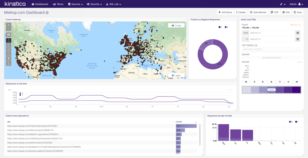
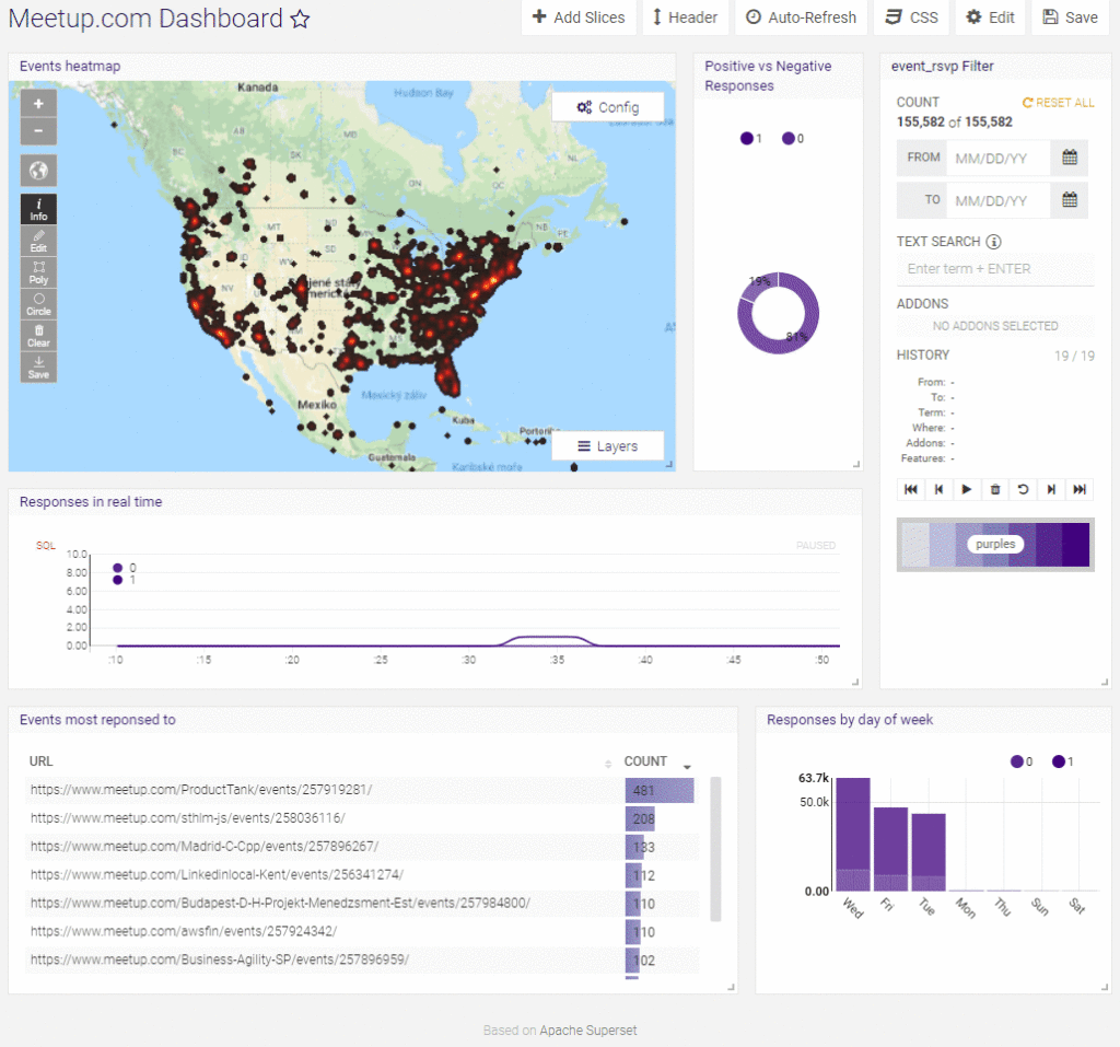
We have prepared a sample dashboard showcasing some of the possibilities provided by Reveal. The dashboard contains the following visualizations:
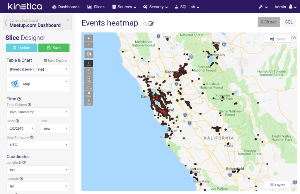
- Heatmap of all RSVPs
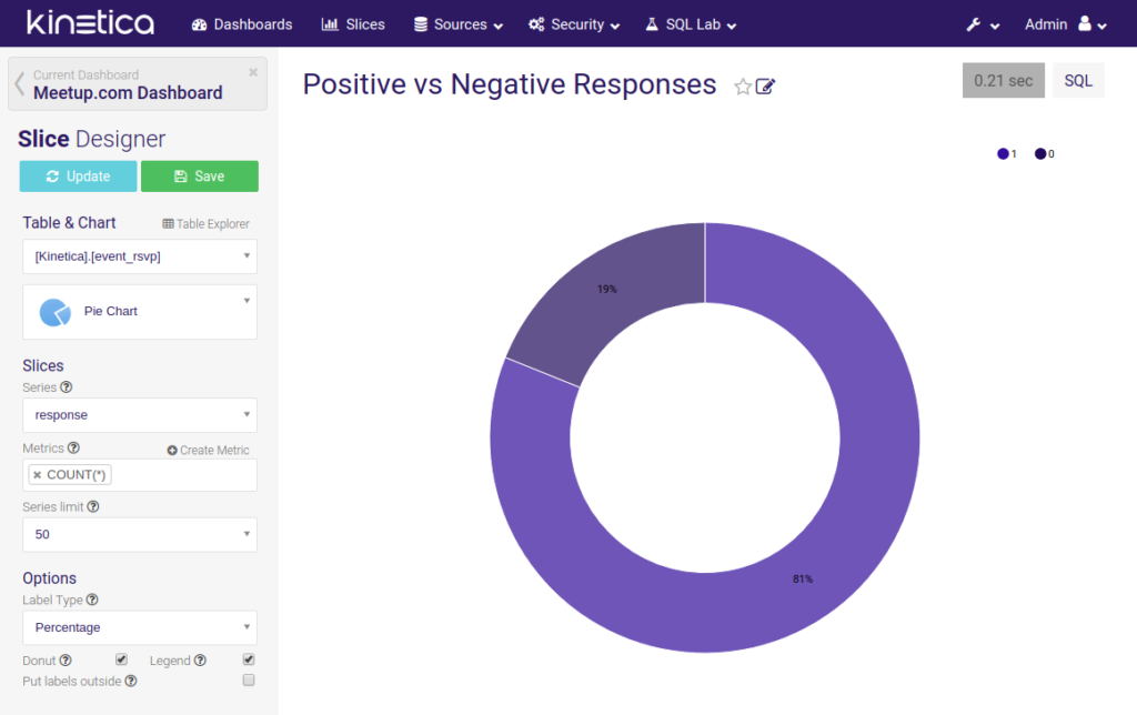
- Simple pie chart displaying the ratio of positive and negative responses
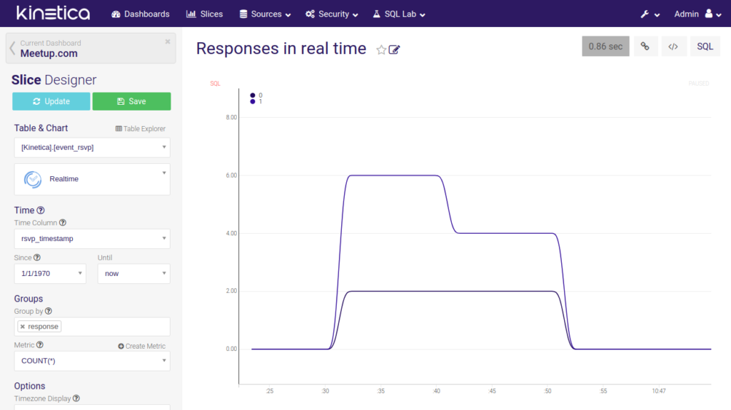
- Responses processed in real time
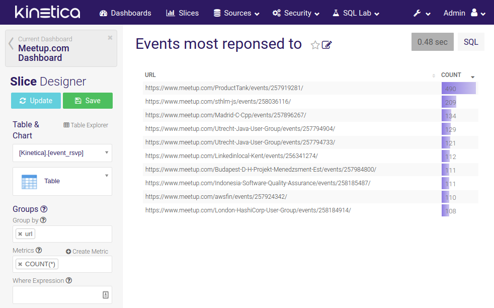
- List of most popular events
- Bar chart displaying number of RSVP responses for each day of the week
Reveal of course provides many other options, including the newest visualization techniques, like word clouds or bubble charts.
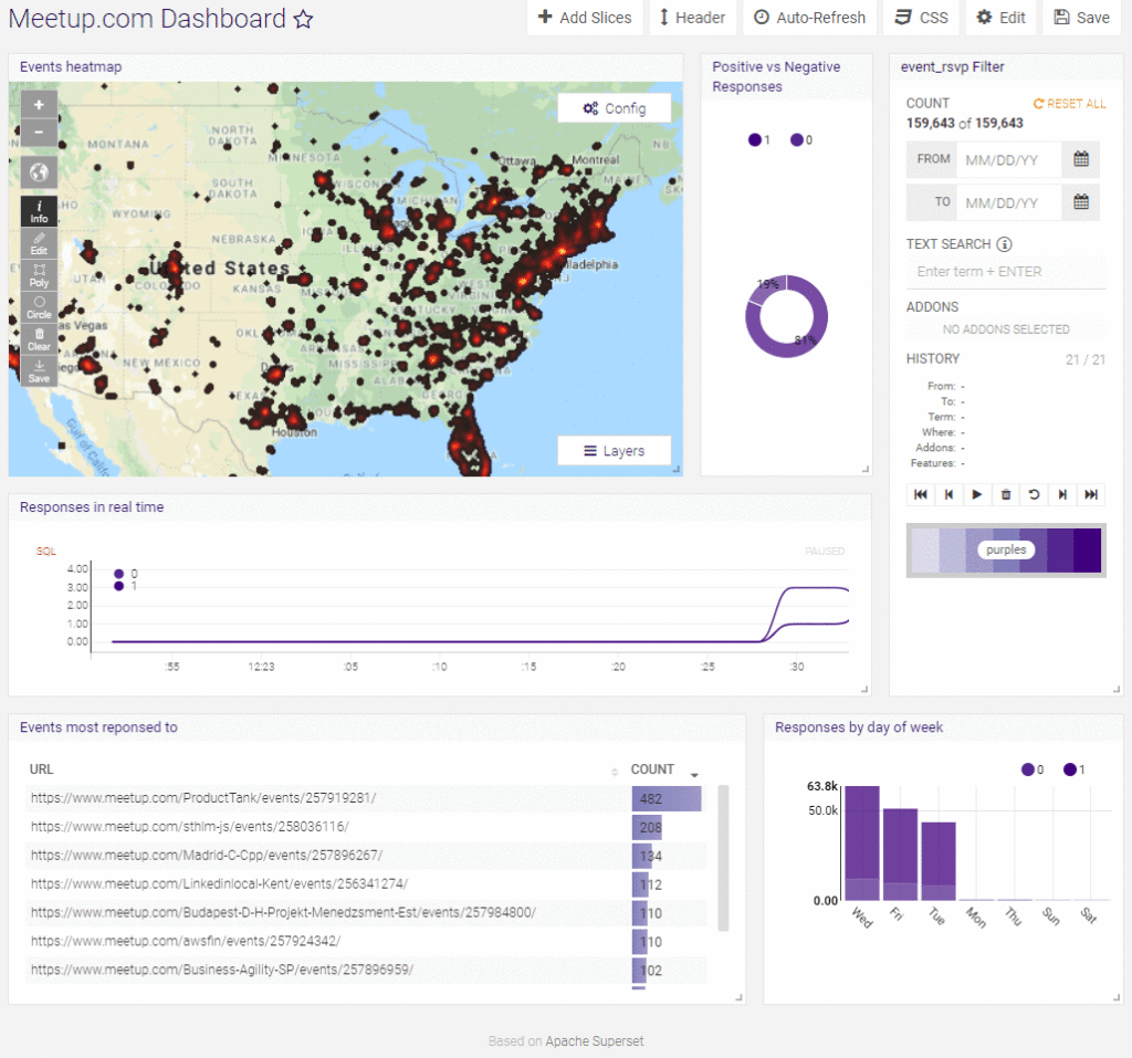
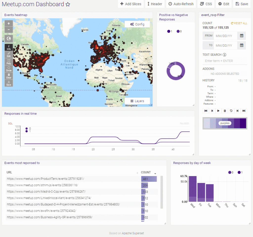
One of the most useful features of Reveal is that all charts in the dashboard are connected. You can, for example, select an area on the map and all the other charts will update to visualize only RSVPs matching this filter:
You can mark a circle or any polygon of your choice:
We can also select just the positive responses from the pie chart. All other charts including the map will then visualize only this subset of data.
You have now seen how a dashboard might look like and what it can do. Now, let’s dive into the process of creating one.
Connecting and configuring database tables
Individual visualization elements on the dashboard are called slices. To create a slice, you have to select Slices in the top bar and then click on the Plus icon.
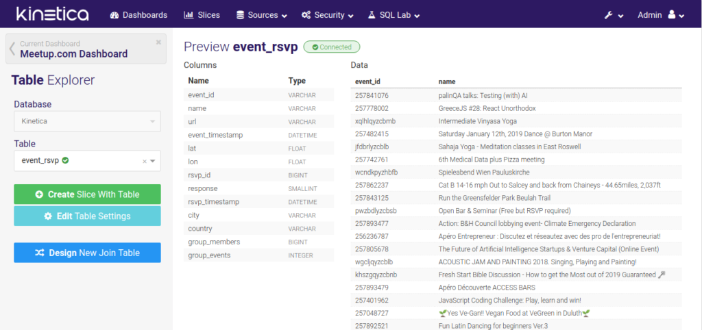
The dialog asks you to choose a table you want to visualize. You can select a table from the database or create a new one by joining other tables. Before you can do anything else with the data, the table needs to be connected. Reveal uses a separate SQLite database to store all the dashboard and slice settings and also some metadata about the tables you want to visualize. Connecting a table means creating a record in this auxiliary database.
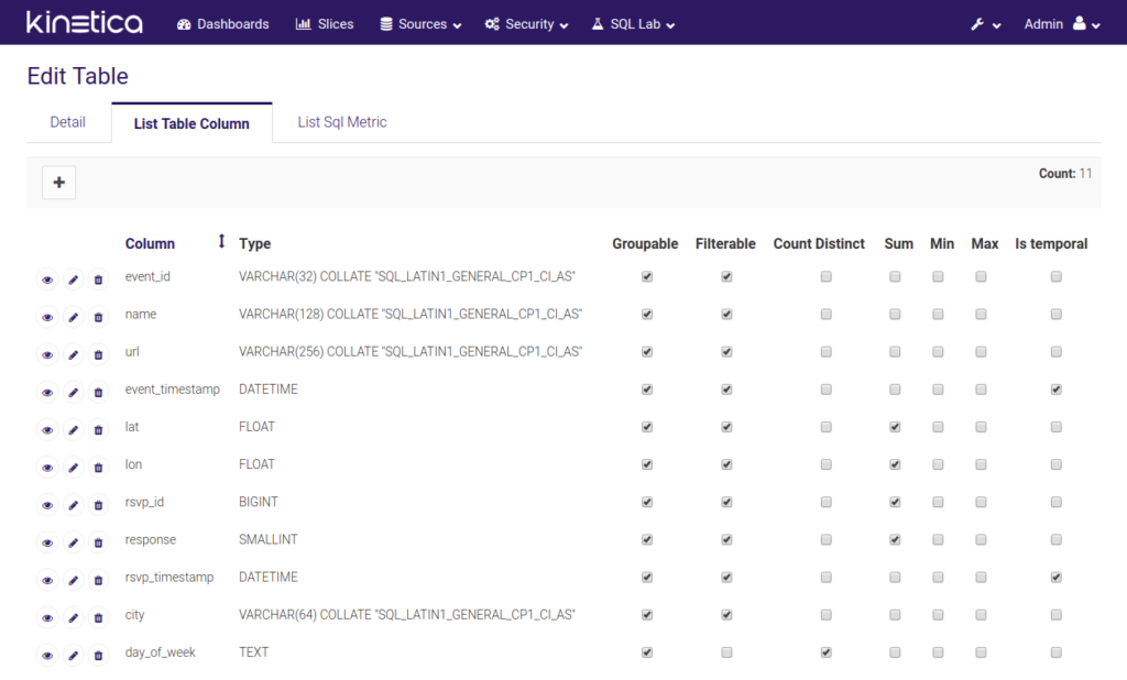
Once the table is connected you can modify the settings to allow or forbid certain visualization possibilities. To open the table configuration you need to select Sources -> Tables in the top menu and then click on the Edit record pencil icon near the table you want to change. For our dashboard, we are interested mostly in the List Table Columns tab:
You will notice a lot of tick boxes on the screen. The Groupable option tells us whether the column can be used to separate data into multiple groups (which are then usually represented by different colors in the charts). We are, for example, distinguishing between yes and no responses to Meetup events.
The filterable column, on the other hand, allows or prevents you from using a column when filtering data. If the option was left unchecked for lat and lon, we wouldn’t be able to filter data by selecting an area on the map as in the example above.
The last option that’s important for us is Is temporal. It is used to mark columns containing information about time. This is required for certain types of slices like Time Series line.
Computed columns
What if you wanted to visualize the number of responses on each week day? We have no Day of week column in our database, but we know that the information is part of the response’s timestamp. In SQL you can use DAYOFWEEK() to retrieve it. In Reveal Computed columns are the way to go. This feature allows you to write SQL expressions to compute new value from real columns stored in the database.
This is exactly the case of the day_of_week column in our event_rsvp table. If you click the Edit record button near the column, you can see that there is an Expression field in the settings form and it contains a piece of SQL:
CASE
WHEN DAYOFWEEK(rsvp_timestamp) = 1 THEN ‘Sun’
WHEN DAYOFWEEK(rsvp_timestamp) = 2 THEN ‘Mon’
WHEN DAYOFWEEK(rsvp_timestamp) = 3 THEN ‘Tue’
WHEN DAYOFWEEK(rsvp_timestamp) = 4 THEN ‘Wed’
WHEN DAYOFWEEK(rsvp_timestamp) = 5 THEN ‘Thu’
WHEN DAYOFWEEK(rsvp_timestamp) = 6 THEN ‘Fri’
ELSE ‘Sat’
END
This creates a column which allows us to access a nicely formatted name of the week day and use it in our visualizations without any changes in the database.
Visualizing data using slices
Now our table is configured and ready to provide all the data needed to create all the visualizations we want. Let’s have a look at how different slices in our dashboard are defined.
Reveal provides a visual editor to create your slices. The first step of the creation process is selecting a table you want to visualize and choosing the type of visualization. As of this writing, 33 different visualizations are available. Kinetica also provides an SDK allowing you to create custom Reveal widgets.
Filter slice
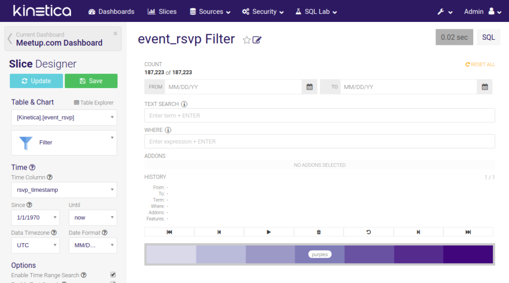
When you create a dashboard, Reveal will also automatically create a Filter slice. This slice allows you to filter data displayed in all other slices. You can write a SQL expression, select a time range, perform full-text search, or change the color theme.
In our case it is important to choose the correct Time column in the slice configuration. When it comes to filtering by time, we want to do it by rsvp_timestamp, not event_timestamp.
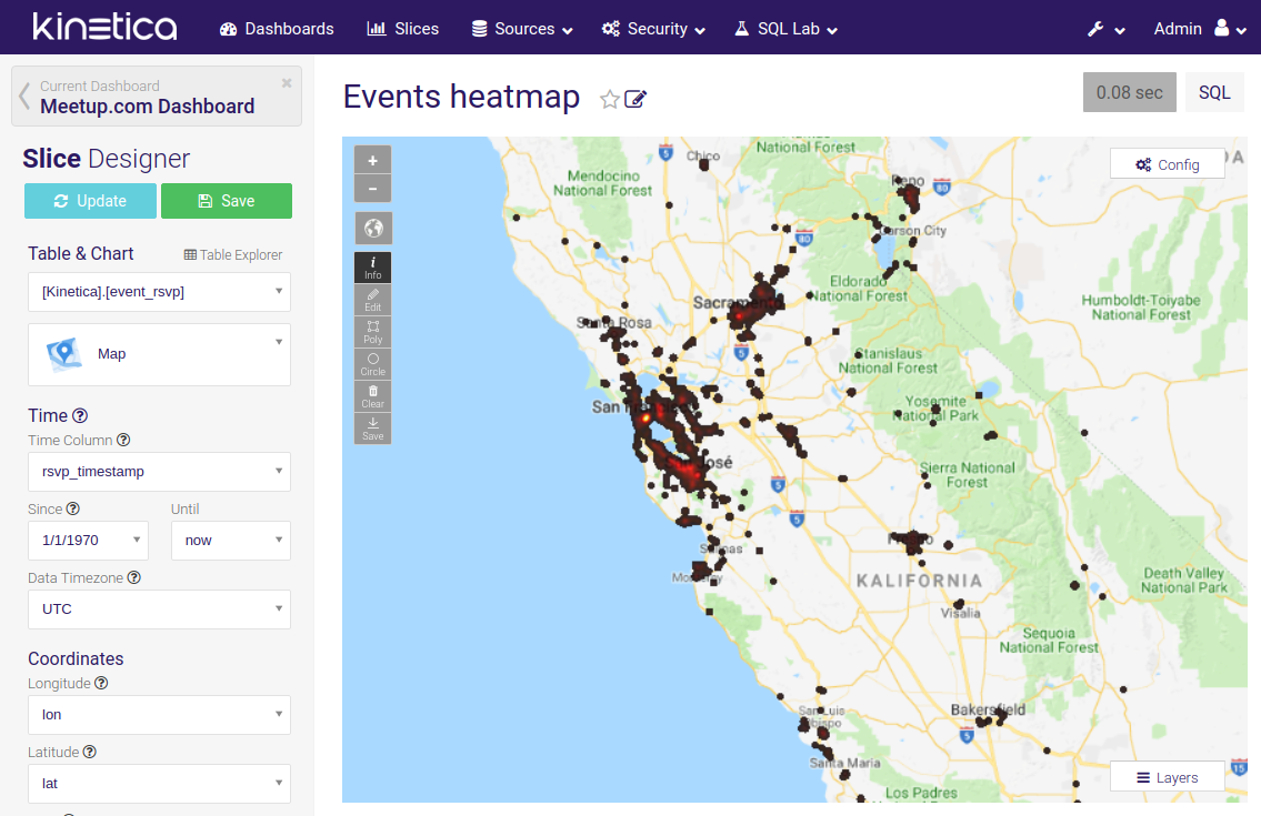
Events heatmap
For the Map slice we need to set the correct coordinate columns. In our case, we use separate lon and lat columns, but you can also select a column containing WKT strings. We must also check if the correct time column is selected. Otherwise, filters might not work correctly.
In our slice, we are displaying a heatmap, but you can also choose to show individual points or paths. Other options include selecting the default zoom and position on the map.
Positive vs Negative responses
For this visualization, we used a simple pie chart. The two most important configuration options here are Series and Metrics. Series determines which column is used to divide the chart into multiple areas representing different categories. Metric then determines the size of each part.
In our case, we selected the response column as our series (its value is either 0 for a no response or 1 for a yes response), and we simply want to compare the row count.
Responses in real time
One of the most powerful types of visualization is the Real-time line. It allows you to monitor events (almost) as they occur in real time. We are, for example, displaying how many people are currently responding to Meetup events.
Again, it’s very important to choose the correct time column. As in the pie chart, you can select a group by column used to separate all responses into multiple groups (yes and no responses). The chart displays the data aggregated over a short period of time (5 seconds by default). Therefore, you also need to choose an aggregation metric. We are using COUNT(*), but if your application demands it, you can also use other functions like SUM() or AVG().
Events most responded to
This is a simple table slice. It groups data by a value of a certain column, or url in our case, and calculates the chosen metric for each group – for example, the number of responses to an event (COUNT(*)). You can also provide a where expression to focus on a selected subset of data.
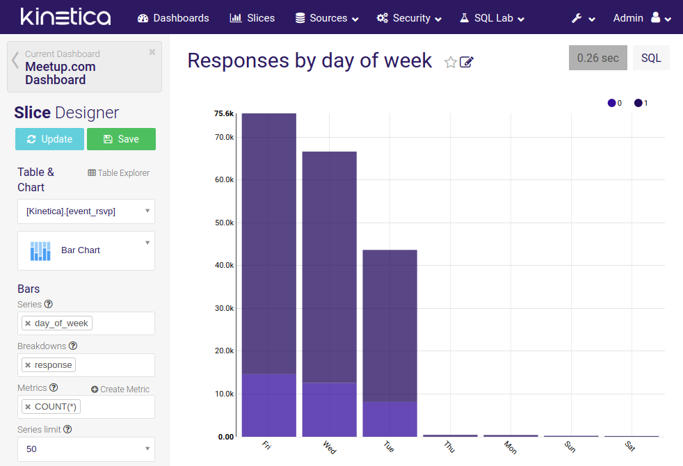
Responses by day of week
The last slice is a bar chart visualizing the number of responses for each week day. The situation is similar to previous cases. The series option is used to select the column defining our bars. Then we choose a metric determining the height, and additionally also select the response column to break each bar into two parts (yes and no responses).
Exporting and importing dashboards
Currently, Reveal does not provide an option to export or import data from the GUI. This functionality will be added in the future, but if you need to back up your visualizations, there is a way to do it now. Inside Kinetica’s file structure, there is an undocumented import and export script. To export a dashboard, all you need to do is to execute the following command:
/opt/gpudb/connectors/reveal/lib/python2.7/site-packages/caravel-0.11.0-py2.7.egg/caravel/reveal-utils.py export “Meetup.com Dashboard” /opt/gpudb/connectors/reveal/var/caravel.db where_to_export.db
To run the command inside a container, just add docker-compose exec kinetica in front:
docker-compose exec kinetica /opt/gpudb/connectors/reveal/lib/python2.7/site-packages/caravel-0.11.0-py2.7.egg/caravel/reveal-utils.py export “Meetup.com Dashboard” /opt/gpudb/connectors/reveal/var/caravel.db target.db
You should also store the exported file in such a way that makes is accessible to the outside world, for example in a mounted directory.
If you want to do the opposite and import a backed up dashboard, you have to replace the export sub-command by import and switch source and destination paths:
/opt/gpudb/connectors/reveal/lib/python2.7/site-packages/caravel-0.11.0-py2.7.egg/caravel/reveal-utils.py import “Meetup.com Dashboard” source.db /opt/gpudb/connectors/reveal/var/caravel.db
Conclusion
In this article we described how you can easily create beautiful visualizations of your data using Kinetica’s Reveal application. Creating and modifying slices requires only minimal programming knowledge (just a bit of SQL), so it’s an ideal tool for analysts and managers.
The large variety of visualizations you can use is great. But the feature we like the most is the connection between slices. So, if you for example select an area on a map, other charts will automatically update to display only filtered data.
In the next article we are going to show you how you can use Kinetica’s Javascript API and Kickbox.js library created in collaboration with Mapbox.com to create custom web applications visualizing data stored in the Kinetica database.
Check out the other blogs in this series:
